Hamad Medical Corporation
HMC in Qatar
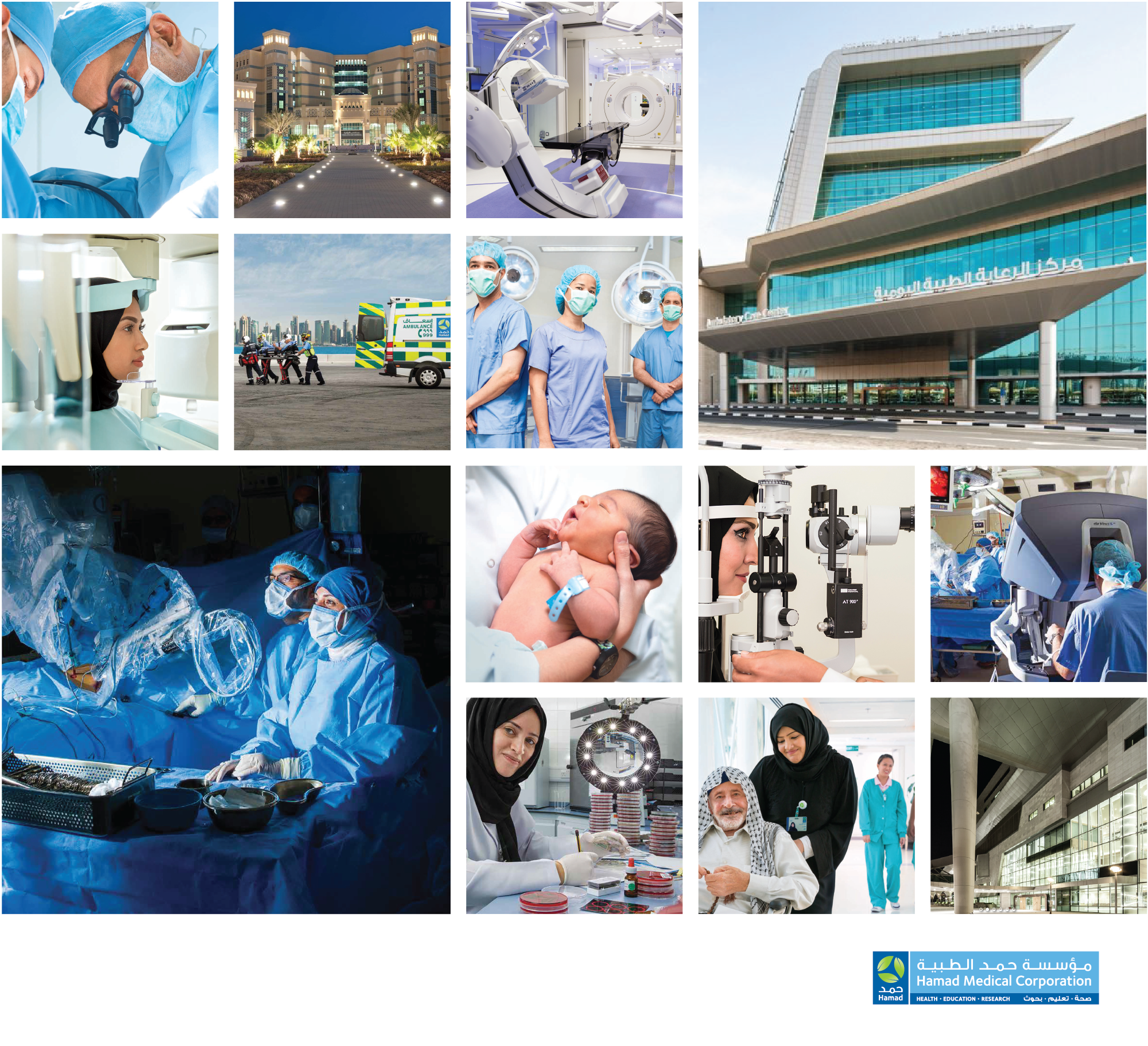
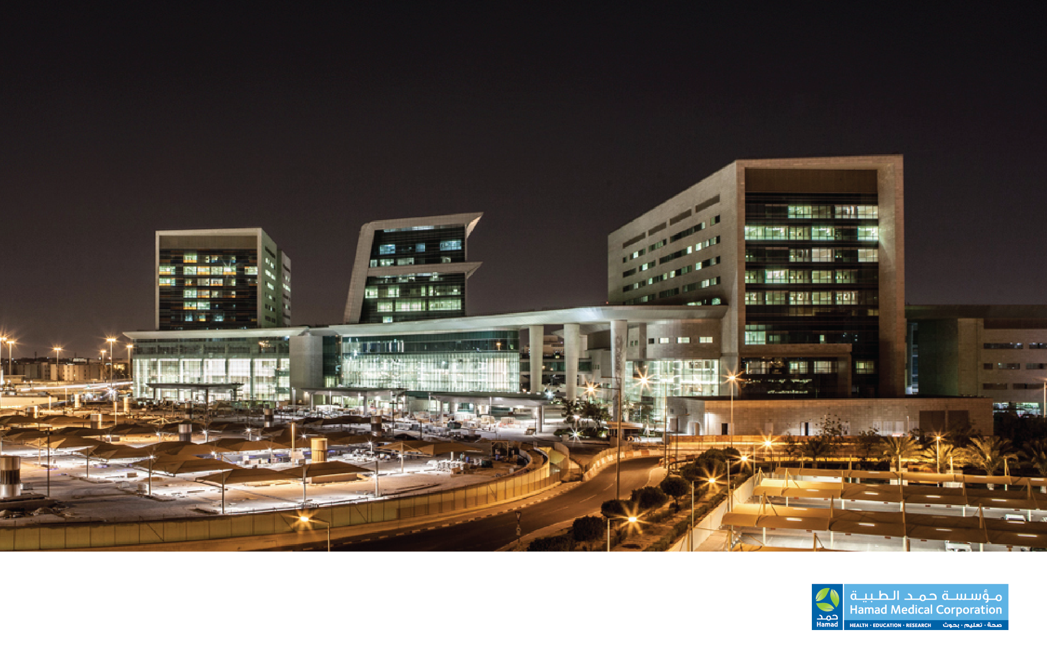
HMC is the largest healthcare provider in Qatar, one of the premier health services in the middle East. The corporation consists of more than 12 main hospitals, the Ambulance Service, Residential Care Services, research and academic facilities, currently with over 18,000 employees and set to grow with ambitious plans through to 2030.
The project was to develop and implement a new brand identity across the entire corporation, defining HMC’s core values and positioning within Qatar and the Middle East.
One of the initial elements of the project was to define the corporate structure, HMC is continually expanding and evolving so a scalable approach was needed when setting out the corporation hierarchy
Currently nine HMC hospitals have been brought in to the brand, each hospital has a crafted type logo set in Arabic and Latin, literature tailored to each of the hospitals depending on there specialities, a range of additional assets available under the master brand.
The master brand has two main faces, two bands of colour are designated for business of internal use and when the brand is public facing individual leaves from the icon can be used, the leaves are arranged in a pattern or overlaid with colour and transparency setting a more informal personality.
An expansive set of guidelines was developed detailing all aspects of how the brand is used and adapted across the corporation, from the hierarchy, logo creation, printed communications, imagery, external signage, uniforms, exhibitions, conferences and online.
Many materials have been developed for circulation throughout HMC
For a large organisation there is need for a constantly growing range of printed brochures, magazines and newsletters, all developed from the guidelines for layout, photography and typography.
Many vehicles other than the emergency vehicles have been appropriately branded, from staff cars with the leaf identity to the huge blood trucks wrapped with bespoke graphic treatment.
The Future of Healthcare was a conference and press event, a fast turnaround graphic package was requested for large 3m heigh exhibition walls with additional banners, posters and freestanding monoliths, the event branding was developed with a timeline theme and artworked for production.
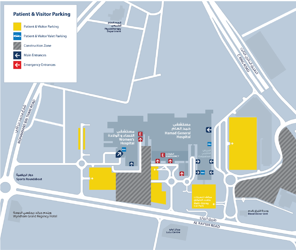
Maps have been developed for hospital, site and regional navigation, a new map style was developed for each type with clear icons and colouring systems, a printed handheld maps with a grid system was developed for each hospital with Arabic and English sides.
Posters and large format print have been created for a wide range of applications
Patient information leaflets and booklets are needed for a vast range of subjects, a style has been set and guidelines for this been developed, designed to be clear with open layouts and consistent photography and illustrations, a huge range of forms has also been rationalised and made consistent.
In many wards clear precaution and action graphics are needed, with such a multicultural environment language cannot be solely relied on, so a clear instruction illustration style was developed to to convey important information fast, the style was standardised thought the corporation.
The hospitals original signage varied significantly, signage systems with consistent typography and symbols were developed and and implemented internally and externally.
A large web standards sections was created in the guidelines to assist with keeping the online consistent with off line, the website continues to develop using more of the assets developed by the marketing department.
brand developed whilst at Endpoint Middle East


